24 Typography Terms Every Marketer Should Know [Infographic]
As a marketer in the digital age, you wear many hats. You‘re a storyteller, a data analyst, a brand ambassador, and more. But one role you might not realize is equally important is that of a typographer. No, you may not be designing fonts from scratch, but every time you create an email, a social media post, an ad, or any other piece of content, you are making crucial choices about typography that affect how your message is perceived and received.
Typography—the art of arranging letters and text in a way that is legible, readable, and visually appealing—is a field with its own unique terminology. And while marketers don‘t need to be experts in every nuance of typography, familiarizing yourself with key terms can help you better understand the foundations of typography and how to apply it effectively in your work.
To help you build your typography vocabulary, we‘ve put together an infographic highlighting 24 essential typography terms every marketer should know. But before we dive into the visual, let‘s explore these concepts in more detail.
Anatomy of a Typeface
Let‘s start with some fundamentals: the building blocks that make up letters and fonts.
-
Typeface refers to a family of fonts (like Helvetica or Garamond), while font refers to a specific weight, width, or style within a typeface family (like Helvetica Bold or Garamond Italic). So all fonts are typefaces, but not all typefaces are fonts.
-
The individual characters that make up a font are called glyphs. Glyphs include letters, numbers, punctuation marks, and symbols.
When describing the parts of a glyph, typographers use very specific terminology:
- The main vertical stroke in a letter is called the stem (like in a "T" or "P").
- A curved stroke is called a bowl (like in a "b" or "d").
- The thin strokes that connect thicker strokes are called links or spines (like in an "m" or "n").
- The stroke that extends below the baseline in a lowercase "g" or "y" is called a tail or descender.
- The small stroke that extends from the upper right of a lowercase "r" or "j" is called an ear, neck, or hook.
- The enclosed space in a lowercase "e" is called an eye.
- The point at the top of a capital "A" is called an apex, while the bottom points are called vertices.
- Angled strokes (like in a "W" or "Z") are called diagonals.
- The end of a stroke that doesn‘t include a serif is called a terminal.
- And of course, serifs are the small decorative strokes at the ends of the main strokes in some typefaces.
Font Styles & Variations
Fonts come in countless styles and variations. Some of the most common classifications include:
- Serif fonts have those decorative strokes (serifs) at the ends of letters. They‘re often seen as traditional or classic.
- Sans serif fonts lack serifs, giving them a clean, modern look. Popular sans serifs include Arial, Helvetica, and Verdana.
- Script fonts are based on handwriting, often with connecting strokes between letters. They can convey elegance and sophistication.
- Display fonts are highly stylized and decorative, meant for use at large sizes for short copy (like titles) rather than lengthy blocks of body text.
Other variations of a typeface include:
- Italic and oblique versions, which have a slanted appearance. True italics are uniquely designed with slanted letterforms, while obliques are simply tilted versions of the upright (roman) characters.
- Different weights, ranging from thin to bold to black. Weight indicates the thickness of the strokes.
- Different widths, including condensed, normal, and extended versions that affect the overall width of the characters.
- Number styles, such as lining (numbers all have the same height) and oldstyle (numbers have varying heights like lowercase letters).
Spacing & Alignment
The positioning and spacing of type is just as important as the letterforms themselves. Key concepts related to spacing and alignment include:
- Baseline – the invisible line that letters "sit" on. Some letters extend below the baseline (descenders), while others extend above it (ascenders).
- X-height – the height of lowercase letters from the baseline to the top of the main body of the letter (typically the height of a lowercase "x").
- Cap height – the height of capital letters from the baseline to the top of the letter.
- Tracking – the overall horizontal space between letters in a block of text. Tighter tracking means letters are closer together, while looser tracking means they are farther apart.
- Kerning – the space between specific letter pairs. Some letter combinations look better with tighter or looser spacing.
- Leading – the vertical space between lines of text (technically the space from one baseline to the next). Leading is measured in points.
- Horizontal alignment – how text is aligned in relation to the margins. Text can be flush left (ragged right), flush right (ragged left), centered, or justified (flush on both left and right).
- Vertical alignment – the positioning of text in relation to the baseline. Subscript and superscript text are set slightly below or above the baseline.
Readability Factors
The ultimate goal of typography is to make text easy to read and understand. Several key factors affect readability:
- Legibility refers to how easily individual letters can be distinguished from one another. Legibility is influenced by the typeface design, size, and spacing. More legible fonts are easier to read at smaller sizes or from farther distances.
- Point size is the most basic factor in legibility. Larger point sizes are more legible than smaller ones. For print, body copy is typically set between 10-12 points. For digital screens, 16 pixels is a common minimum size since screens are typically viewed from farther away than printed material.
- Line length is the distance from the start to the end of a line of text. Longer line lengths generally require more leading (line spacing) to remain readable. A good rule of thumb is 45-75 characters per line (including spaces) for body copy.
- Contrast refers to the difference in luminance or color between the text and the background it appears on. Black text on a white background provides maximum contrast, while lower contrast combinations (like light gray text on a white background) can strain the eyes.
- Font choice greatly affects readability. Complex or decorative fonts may look interesting but can be difficult to read, especially at small sizes. Straightforward, conventional fonts (like serif or sans serif) tend to be most readable for lengthy passages.
Typographic Color
In typography, "color" doesn‘t necessarily refer to literal hues like red or blue. Rather, typographic color refers to the overall darkness or lightness of a block of text.
Several factors influence typographic color:
- The typeface itself can be light or dark depending on the design of the letterforms. Thicker, heavier fonts will appear darker on the page or screen.
- The weight of the font directly affects color. Bolder weights create more typographic color than lighter weights of the same font.
- Spacing, including tracking and leading, affects typographic color. Tightly tracked or leaded type will appear darker than more generously spaced type.
- Alignment affects color. Because our eyes see the ragged right edge of flush left text as a "lighter" area, flush left text blocks will appear slightly lighter than justified text.
The goal is to achieve even typographic color for a smooth, uninterrupted reading experience. Uneven color can cause a blotchy or "dazzling" effect that tires the eyes.
Web Typography Considerations
Designing for screens adds an extra layer of complexity to typography. Some key considerations for web typography include:
- Font loading – Web fonts often need to be downloaded by the user‘s browser before they can be displayed. This can cause a delay in the text appearing on the screen, or a "flash of unstyled text" where the text first appears in a fallback font before switching to the web font. Strategies like preloading or using font-display CSS can help mitigate these issues.
- Responsive typography – With the proliferation of different screen sizes and resolutions, web typography needs to adapt and scale gracefully. Using relative units like ems or rems instead of fixed pixel sizes allows type to resize based on the user‘s screen. Media queries can also adjust font sizes, line heights, and other properties at different breakpoints.
- Variable fonts – Variable fonts are an emerging font format that allows a single font file to include multiple variations of a typeface, like different weights or widths. This provides greater design flexibility with potentially faster load times compared to using separate font files for each variation.
Pairing Fonts
Most designs use more than one font. When combining fonts, it‘s important to strive for pleasing contrast rather than conflict. There are two main approaches to font pairing:
- Concordant pairings use fonts that are similar in style, structure, and proportions for a harmonious look. An example might be pairing two different serif fonts.
- Contrasting pairings use fonts that are distinctly different but complementary, like a serif paired with a sans serif. The contrast in styles creates visual interest.
Some font pairing best practices:
- Limit yourself to 2-3 fonts to avoid a cluttered, chaotic look.
- Assign distinct roles to each font, like using one for headlines and another for body copy.
- Balance competing moods, like pairing an elegant font with a straightforward one.
- Create contrast in scale by varying the font sizes.
- Test the fonts together at different sizes and weights to ensure they work well in context.
Some classic font pairings include:
- Minion Pro (serif) + Myriad Pro (sans serif)
- Goudy Old Style (serif) + Gill Sans (sans serif)
- Garamond (serif) + Helvetica (sans serif)
- Caslon (serif) + Univers (sans serif)
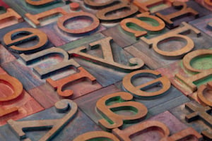
Infographic Explanation
Now that we‘ve explored these typography terms in depth, let‘s take a look at the infographic for a visual overview.
The infographic is divided into sections based on the categories we‘ve discussed:
- Anatomy, illustrating the parts of letterforms
- Styles & Variations, showing different font classifications and variations
- Spacing & Alignment, visualizing concepts like tracking, kerning, leading, and alignment
- Readability, highlighting factors like point size, line length, and contrast
- Typographic Color, demonstrating how factors like font weight affect overall darkness
- Web Considerations, depicting ideas like responsive type and variable fonts
- Pairing Fonts, illustrating different approaches to combining typefaces
Seeing these terms illustrated can help solidify your understanding and provide a handy reference to revisit in the future. The infographic makes these technical terms more approachable and memorable.
Conclusion
Typography may seem intimidating at first, with its specialized vocabulary and technical specifics. But taking the time to learn key typography terms is a worthwhile investment for any marketer.
Understanding how to analyze and apply typography will serve you in several ways:
- You‘ll be able to provide more specific, constructive feedback to designers and ensure marketing collateral is polished and effective.
- You‘ll be empowered to make better typographic choices yourself in the content you create.
- You‘ll sharpen your eye for typography and gain a deeper understanding of how fonts affect your brand‘s identity and perception.
Beyond the practical benefits, learning about typography can also be a source of creative inspiration. As you dive deeper into this world, you may find yourself noticing and appreciating the nuances of type all around you, from storefronts to book covers to movie titles.
Of course, typography is a vast field and there will always be more to learn. But familiarizing yourself with these 24 core concepts is a strong foundation to build on. Armed with this essential terminology, you‘ll be well on your way to being a more knowledgeable and effective marketer when it comes to all things typography.