Designing the Perfect Subway Map: Lessons From Cities Around the World
Since the first underground rail systems emerged in the 19th century, designers have grappled with a central question – what makes the perfect subway map? Is it better to represent the chaotic interwoven lines as they actually are, snaking beneath the city streets with twists and turns? Or is it more effective to abstract and simplify those lines, distorting the geography to create a diagram that‘s easy to decipher at a glance?
As subway systems grew more extensive and complex, the trend has shifted decidedly towards the latter approach. Riders navigating an unfamiliar city need to quickly make sense of the metro network. Geographical accuracy is less important than being able to clearly trace lines and spot transfer points. Simplicity, it turns out, trumps precision when it comes to subway wayfinding.
The Turning Point: Massimo Vignelli‘s Iconic 1972 New York City Subway Map
Perhaps no subway map better epitomizes this design philosophy than Massimo Vignelli‘s 1972 New York City subway diagram. Tasked with bringing visual order to the tangled web of NYC subway lines, the famed Italian designer took drastic measures. He straightened all lines to 45 or 90 degree angles – no more meandering curves. He eschewed geographical features and landmarks. Even Central Park, normally a rectangle, became a square. The colors were bold and minimal.

Left: Vignelli‘s 1972 map. Right: Today‘s more geographically-oriented map. (Source: 99designs)
While lauded as a modernist masterpiece, many New Yorkers bristled at the liberties taken with their city‘s geography. By 1979, the MTA bowed to public pressure and replaced it with a more traditional map. But Vignelli‘s legacy endures. His map captured the essence of good transit map design: clean, uncluttered, easy to read. Abstraction in service of usability.
The Psychology Behind Great Subway Map Design
What is it about maps like Vignelli‘s that make them so much more readable than their geographically accurate counterparts? Cognitive psychology offers some clues:
-
Visual Decluttering: Removing unnecessary details like curved lines, dense street grids, and other geographical features reduces cognitive load. This frees up mental bandwidth to focus on the task of charting a route.
-
Edge Detection: Our visual cortex is great at perceiving contrast and sharp edges. Straight lines with 45/90 degree angles tap into this, making the paths easy to distinguish and trace compared to tangled spaghetti.
-
Color Coding: Judicious use of color allows viewers to quickly differentiate subway lines without having to read labels. The human brain processes color faster than text.
-
Highlighting Transfer Points: Multi-line transfer stations are the most important points in the network to highlight boldly, as they are key to navigating the system. Accentuating them helps riders strategize routes.
In a famous study, researchers at MIT found that "a [subway] map need not stay geographically faithful to be visually useful..[sic] designing in-car navigation maps that take peripheral vision into account could potentially save lives." Vignelli was clearly onto something, neurologically speaking.
Subway Maps From Around the World: Hits and Misses
So which other cities have taken these lessons to heart in crafting their own metro maps? Let‘s tour some notable examples of both simple, elegant designs and cluttered, confusing ones.
London, England

Like Vignelli‘s NYC map, London‘s classic Tube map abstracts the complex network into straight lines, eschewing most geographical references. The use of bold, distinct colors for each line makes visual separation a breeze. London‘s map is iconic for a reason – it just works.
Tokyo, Japan

In contrast, Tokyo‘s subway map is notoriously convoluted, with a dizzying array of crisscrossing lines and transfer points all fighting for attention. With so many dense nodes clustered in the city center, deciphering it becomes an eye chart test. Certainly not a model of elegant simplicity.
Berlin, Germany
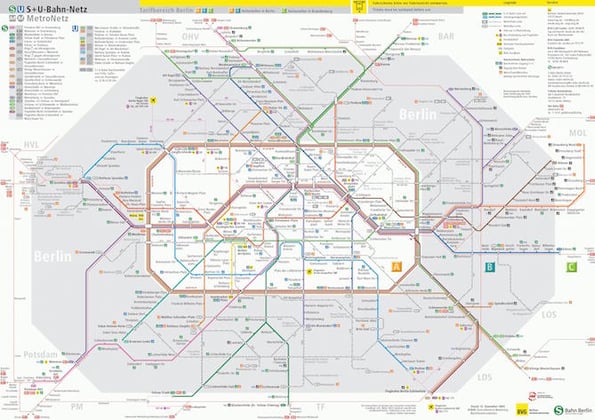
Berlin‘s U-Bahn map strikes a nice balance, with mostly straight lines but a few gentle curves that give geographical context. The bright primary colors and emphasis on transfer hubs make for an easily scannable map. No surprise it rates highly in academic studies of subway map usability.
Mexico City, Mexico

Mexico City‘s subway map, while praised for its creative iconography, suffers in the simplicity department. The zig-zagging lines with their 60 degree angles and lack of coloration for differentiation lead to a lot of visual noise. Overlaying it on actual city streets further hinders clarity.
Moscow, Russia
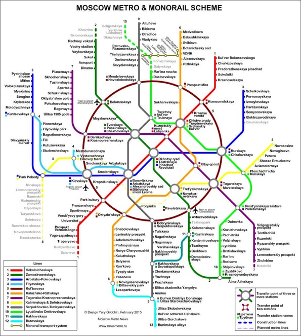
Over its lifetime, the Moscow Metro map has grown more abstract and streamlined with each redesign. The latest version employs bold colors, clean lines, and tasteful geometry – all radiating out from a ring like spokes. The transfer hubs are clear focal points. A strong example of iterative improvements.
Key Takeaways for Effective Subway Map Design
From studying the hits and misses of metro maps worldwide, a few central design tenets emerge:
-
Embrace abstraction – Subway maps are diagrams, not exact street-level replicas. Distorting geography to simplify navigation is not just acceptable, but desirable.
-
Stick to clean lines and geometry – Avoid visual clutter with disciplined use of crisp, straight lines and minimal curves. Restrict angles to 45 and 90 degrees when possible.
-
Color-code with purpose – Assign each subway line a bold, distinct color to differentiate them at a glance without relying on text. When in doubt, less is more.
-
Make transfer hubs evident – Highlight key transfer stations where lines intersect, as these are the most important decision points for riders. Make them pop.
-
Give context, but don‘t overstuff with detail – Including some geographical elements for orientation is helpful, but not at the expense of simplicity. Striking this balance is key.
Ultimately, the goal is to create a map that riders can parse and plan routes with in seconds, even amid the sensory overload of a busy station at rush hour. The best subway map designs achieve this through elegant simplicity, lending a reassuring sense of order to an otherwise chaotic system.
Of course, uncoiling complicated transit networks into an easy-to-follow diagram is no simple feat. It‘s both an art and science, with more than a dash of psychology thrown in. But for the sake of riders everywhere, it‘s a worthy challenge for designers to keep pursuing. The subway map is often the first impression and public face of a metro system – best to put your best foot (or line) forward.

![The Top Types of AI-Generated Content in Marketing for 2024 [New Data, Examples & Tips]](https://greenlitcontent.com/wp-content/uploads/2026/04/20260423043541-69e9a19d2056e-768x402.png)