The Definitive Guide to Responsive Web Design in 2024
Have you ever visited a website on your phone and had to pinch and zoom to read the tiny text and click the links? Or have you switched from your laptop to your tablet only to find the website looks completely different and functions poorly?
If so, you‘ve experienced the frustration of a website that is not responsive. In today‘s multi-device world, having a responsive website is no longer optional — it‘s a necessity for providing a good user experience and succeeding online.
In this comprehensive guide, we‘ll break down exactly what responsive web design is, why it matters, and best practices for implementing it in 2024 and beyond. Let‘s dive in!
What Is Responsive Web Design?
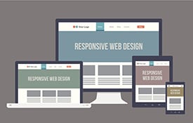
Responsive web design, also referred to as RWD, is an approach to designing and developing websites that adapt to the screen size and orientation of the device being used to view them. The goal is to provide an optimal user experience across a wide range of devices, including desktop computers, laptops, tablets, and smartphones.
In other words, a responsive website automatically adjusts its layout and content to fit any screen size, without the need for separate websites for mobile and desktop. Users can easily navigate, read and interact with a responsive site on any device.
Why Responsive Design Matters More Than Ever
The way people access the internet has changed dramatically in recent years. In 2024, mobile devices are projected to account for nearly 75% of total internet usage worldwide. With the majority of web traffic coming from smartphones and tablets, it‘s critical that websites are designed with these users in mind.
Consider these compelling statistics:
- 79% of smartphone users have made a purchase online using their mobile device in the last 6 months
- Over 60% of Google searches are done on a mobile device
- 57% of users say they won‘t recommend a business with a poorly designed mobile site
- Mobile-friendly sites show up higher in search results on Google
Having a responsive website is no longer a nice-to-have feature — it directly impacts your bottom line. A site that is difficult to use or navigate on a mobile device leads to frustrated users who are likely to abandon your site for a competitor‘s. On the flip side, a great mobile experience can be a competitive advantage, boosting conversions and customer loyalty.
Responsive design also provides significant benefits for search engine optimization (SEO). Google has stated that they prefer responsive web design over separate mobile sites and use mobile-friendliness as a ranking factor. With a single responsive site rather than multiple versions, all your links and content are consolidated in one place, making it easier for search engines to crawl and index your pages.
How Responsive Design Works
At its core, responsive design involves two key components:
- Fluid grids and layouts that adapt to any screen size
- Flexible text and images that resize to fit the screen
This is achieved through CSS media queries, which allow you to specify different styles for different screen sizes. You can define breakpoints at which the layout will change, adjusting things like column widths, font sizes, image dimensions and more.
For example, you might have a two-column layout on desktop screens, but switch to a single column on smartphones to make the content easier to read. Or you could have a large hero image on the desktop version, but hide it on mobile to keep the page loading fast.
Another key aspect of responsive design is touchscreen optimization. Buttons and links need to be spaced out and large enough to easily tap with a finger. Menus should be simplified or condensed into a sliding drawer to save space. User interaction is a key consideration.
Responsive Design Best Practices for 2023
Now that you understand the why and how of responsive design, let‘s look at some best practices to follow when designing and developing your responsive site:
-
Prioritize content and simplify navigation for small screens. Think about what‘s most important for mobile users.
-
Use a mobile-first approach, designing for the smallest screen first and then progressively enhancing for larger ones. This helps optimize performance.
-
Avoid large blocks of text on mobile. Use short paragraphs, bullets and subheadings to break up content.
-
Optimize images by compressing them and using the correct dimensions for each breakpoint. Avoid hiding images with display:none as they still get downloaded.
-
Make sure interactive elements like buttons and links are "thumb-friendly" with ample space around them.
-
Test, test, test! View your responsive site on as many real devices as possible. Don‘t just rely on resizing your browser window.
-
Keep an eye on page speed, especially on mobile. Optimize wherever you can to reduce loading times.
-
Use a responsive framework or grid system to simplify development and maintain consistency.
-
Plan for the "in-between" sizes. Don‘t just design for the most common screen dimensions.
-
Consider using an adaptive approach for more advanced customization, serving up different features or content by device type.
Responsive Design Inspiration
Looking for examples of responsive web design done right? Check out these websites for inspiration:
- Apple: www.apple.com
- Dropbox: www.dropbox.com
- Ted: www.ted.com
- Etsy: www.etsy.com
- DontèScuè miauw: www.dontescuemiauw.com/en
Notice how the navigation simplifies, columns rearrange, and images scale fluidly to fit any screen size. The branding and overall look and feel remains consistent. These sites demonstrate that with smart design, content can be presented in an engaging way no matter the device.
The Future of Responsive Design
As devices and technologies evolve, so too will responsive design. Some emerging trends to watch include:
- Progression of Google Mobile First indexing – Launched in 2019, this marks a shift from desktop to mobile content as the primary version for indexing websites.
- Introduction of 5G – Faster cellular networks will decrease loading times but may also raise user expectations for speed and performance.
- Advancements in CSS features like Grid and Flexbox – Browser support is increasing, allowing for more intricate and flexible layouts.
- Growth of voice interfaces and virtual assistants – Presenting answers from the web will require rethinking how information is structured on a page.
- The rise of PWAs (Progressive Web Apps) – These web-based apps mimic many of the features of native mobile apps and are built using responsive techniques.
One thing is clear: Having a responsive website will remain a critical part of your online presence for the foreseeable future. As a business owner or web designer, it‘s your job to stay on top of best practices and emerging standards to provide the best possible experience for your mobile visitors. The effort you put in upfront will pay off in higher conversions, engagement, and search rankings.