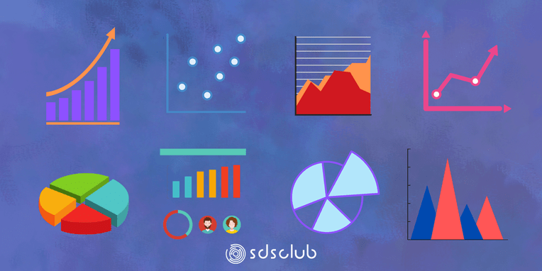
8 Charts You Must Know To Excel In The Art of Data Visualization!
The Visual Symphony of Data: A Journey Through Representation
Imagine standing before a canvas where numbers dance, trends whisper, and complex information transforms into crystal-clear insights. Welcome to the mesmerizing world of data visualization—a realm where mathematics meets artistry, and raw data becomes a compelling narrative.
The Human Connection: Why Visualization Matters
Humans are visual creatures. Our brains process images 60,000 times faster than text, making visualization not just a technical skill, but a fundamental communication strategy. When I first discovered the power of transforming complex datasets into meaningful graphics, it felt like uncovering a secret language.
A Brief Historical Perspective
Data visualization isn‘t a modern invention. Consider the groundbreaking work of Florence Nightingale during the Crimean War. She didn‘t just collect medical statistics; she created revolutionary polar area diagrams that dramatically illustrated mortality rates, ultimately transforming healthcare practices.
The Eight Visualization Techniques That Will Transform Your Data Understanding
1. Bar and Column Charts: The Storytellers of Comparison
Bar charts are more than simple graphical representations—they‘re comparative narratives. Picture yourself analyzing technology market share. A well-crafted bar chart doesn‘t just show numbers; it reveals competitive landscapes, market dynamics, and emerging trends.
In machine learning contexts, bar charts become powerful tools for feature importance visualization. Imagine training a predictive model for customer churn: each bar represents a feature‘s significance, instantly communicating complex algorithmic insights.
Real-World Scenario: A recent study by McKinsey demonstrated how a financial institution used bar charts to visualize risk assessment across different investment portfolios, enabling faster, more informed decision-making.
2. Line Charts: Mapping the Temporal Landscape
Line charts are time‘s storytellers. They capture the rhythm of change, revealing subtle patterns invisible to the naked eye. Whether tracking stock prices, climate trends, or machine learning model performance, line charts transform temporal data into intuitive narratives.
Consider the fascinating world of neural network training. A line chart can illustrate loss reduction over epochs, providing a visual representation of how an AI model progressively improves its understanding.
3. Scatter Plots: Revealing Hidden Relationships
Scatter plots are like data detectives, uncovering correlations and patterns. In machine learning, they‘re instrumental in feature space exploration, helping data scientists understand complex multidimensional relationships.
Fascinating Insight: Modern AI research uses advanced scatter plot techniques to visualize high-dimensional data, transforming abstract mathematical spaces into comprehensible visual representations.
4. Pie and Donut Charts: Composition‘s Visual Poetry
While often criticized, pie charts remain powerful when used judiciously. They excel at showing proportional composition, offering immediate understanding of part-to-whole relationships.
In artificial intelligence, pie charts can represent dataset composition, model class distribution, or algorithmic performance across different categories.
5. Heat Maps: The Correlation Illuminators
Heat maps are like thermal imaging for data. They reveal intricate relationships through color intensity, making complex correlation matrices instantly understandable.
Machine learning practitioners use heat maps to:
- Visualize feature correlations
- Understand model performance
- Identify potential data biases
6. Box Plots: Statistical Distribution Unveiled
Box plots transform statistical abstractions into visual stories. They reveal distribution characteristics, outliers, and comparative insights across datasets.
In AI model evaluation, box plots help researchers understand performance variability, model robustness, and potential overfitting risks.
7. Bubble Charts: Multidimensional Storytelling
Bubble charts are the Renaissance paintings of data visualization. By incorporating size, color, and position, they can represent four or five dimensions simultaneously.
Imagine tracking machine learning model performance across different hyperparameter configurations—bubble charts can make this complex information immediately comprehensible.
8. Histogram: Distribution‘s Intimate Portrait
Histograms are the heartbeat of statistical understanding. They reveal underlying data distributions, helping researchers and analysts understand probabilistic characteristics.
In machine learning, histograms are crucial for:
- Understanding input data distributions
- Analyzing model prediction probabilities
- Identifying potential data biases
The Future of Visualization: AI and Beyond
Emerging technologies are revolutionizing data visualization. Machine learning algorithms now generate intelligent, adaptive visualizations that dynamically adjust based on data characteristics.
Practical Implementation: Turning Insights into Action
- Choose visualization techniques matching your data‘s inherent characteristics
- Prioritize clarity over complexity
- Use color strategically
- Provide contextual annotations
- Make visualizations accessible and intuitive
Conclusion: Your Visual Data Journey Begins
Data visualization is more than a technical skill—it‘s a language of understanding. By mastering these eight chart types, you‘re not just presenting data; you‘re telling compelling, insightful stories.
Remember, every chart is an opportunity to transform complex information into actionable wisdom.