A Collection of 10 Data Visualizations You Must See: Revealing the Art and Science of Visual Storytelling
The Magic of Seeing the Invisible: A Personal Journey Through Data Visualization
Imagine standing at the intersection of art, science, and technology, where complex information transforms into breathtaking visual narratives. As someone who has spent decades exploring the intricate world of data representation, I‘m thrilled to take you on a journey through ten extraordinary data visualizations that challenge our perception and expand our understanding of the world.
Data visualization isn‘t just about presenting numbers; it‘s about telling stories that were previously untellable. Each visualization represents a profound moment of human creativity, where computational power meets artistic vision to reveal hidden patterns, complex relationships, and stunning insights.
1. Climate Change Spiral: A Dance of Global Temperatures
When NASA scientists created the global temperature visualization, they didn‘t just produce a chart – they crafted a visual poem about our planet‘s transformation. Imagine a mesmerizing spiral where each ring represents a year‘s temperature, gradually shifting from cool blues to alarming reds.
This visualization isn‘t merely a scientific tool; it‘s an emotional journey. As the colors transition from serene blues to intense crimsons, viewers experience the visceral impact of climate change. The radial progression mapping transforms abstract temperature data into a narrative that speaks directly to our understanding of environmental shifts.
The technical brilliance behind this visualization lies in its sophisticated data processing. Using advanced algorithms and massive climate datasets, researchers mapped temperature variations with incredible precision. Python‘s Matplotlib library enabled them to create a visualization that is both scientifically accurate and aesthetically compelling.
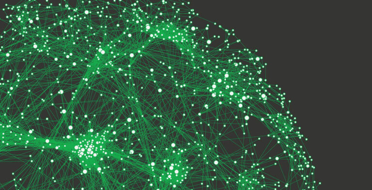
2. The Human Brain: Mapping Neural Galaxies
Neuroscience has always been a frontier of human understanding, and brain network visualizations represent our most ambitious attempt to map the universe within our skulls. These visualizations are less like medical diagrams and more like cosmic maps, revealing neural connections as intricate as star systems.
Using Diffusion Tensor Imaging, researchers can now trace millions of neural connections, representing them as delicate, color-coded threads. Each visualization becomes a unique fingerprint of cognitive complexity, showing how different brain regions communicate and interact.
The computational power required to generate these mappings is staggering. Advanced 3D rendering engines and graph theory algorithms transform raw neurological data into visual masterpieces that look more like abstract art than scientific diagrams.
3. Global Migration: Humanity in Motion
Migration visualizations represent more than geographical movements – they capture human stories of hope, survival, and transformation. By mapping migration routes using advanced geospatial techniques, researchers have created visual narratives that transcend traditional statistical representations.
Imagine flowing lines representing human journeys, their thickness indicating migration volume, their colors revealing motivations – economic opportunities, conflict avoidance, or climate adaptation. These visualizations transform abstract population statistics into deeply human experiences.
The technical complexity behind these mappings involves integrating multiple data sources, from United Nations migration databases to real-time geographical tracking systems. Tools like QGIS and D3.js enable researchers to create dynamic, interactive representations of human movement.
4. Quantum Mechanics: Visualizing the Unimaginable
Quantum mechanics has always been a realm of mathematical abstraction. But now, computational visualizations are allowing us to see the unseeable – probability waves, particle interactions, and quantum uncertainties.
These visualizations are less diagrams and more digital art installations. By mapping Schrödinger equation solutions, researchers create ethereal landscapes showing particle probability distributions. Imagine watching a visualization where particles exist simultaneously in multiple states, their potential locations represented as shimmering, translucent forms.
The computational techniques behind these visualizations involve complex numerical simulations, typically using advanced tools like MATLAB and Mathematica. Volumetric rendering techniques transform mathematical equations into breathtaking visual experiences.
5. Machine Learning: Revealing AI‘s Inner Landscape
As artificial intelligence becomes increasingly sophisticated, visualization techniques are helping us understand the previously opaque decision-making processes of neural networks.
Researchers have developed methods to map neural network architectures, revealing how machine learning models process information. By color-coding neural network layers and showing activation patterns, these visualizations provide unprecedented insights into artificial intelligence‘s inner workings.
Techniques like Gradient-Weighted Class Activation Mapping allow us to see exactly which parts of an image or dataset influence an AI‘s decisions. It‘s like giving AI a transparent brain, allowing us to understand its cognitive processes.
6. Pandemic Transmission: Mapping Invisible Connections
The COVID-19 pandemic accelerated our ability to visualize complex transmission networks. These visualizations transformed abstract epidemiological data into compelling narratives about disease spread.
Network graph modeling techniques allow researchers to show how infections propagate through social and geographical networks. Node sizes represent infection probabilities, while connection strengths reveal transmission dynamics.
These visualizations do more than inform – they educate, helping people understand complex epidemiological concepts through intuitive visual representations.
7. Blockchain Networks: Decoding Digital Transactions
Cryptocurrency and blockchain technologies have spawned fascinating network visualizations. By mapping transaction flows, researchers reveal the intricate structures of digital economic systems.
Directed graph mappings transform blockchain ledgers into stunning visual narratives. Color-coded nodes and weighted edges show transaction patterns, potential anomalies, and network structures.
8. Exoplanet Discoveries: Mapping Cosmic Potential
Astronomical visualizations of exoplanet discoveries represent humanity‘s most ambitious attempt to understand our cosmic neighborhood. These visualizations use color gradients and size variations to represent planetary characteristics, making complex astronomical data accessible.
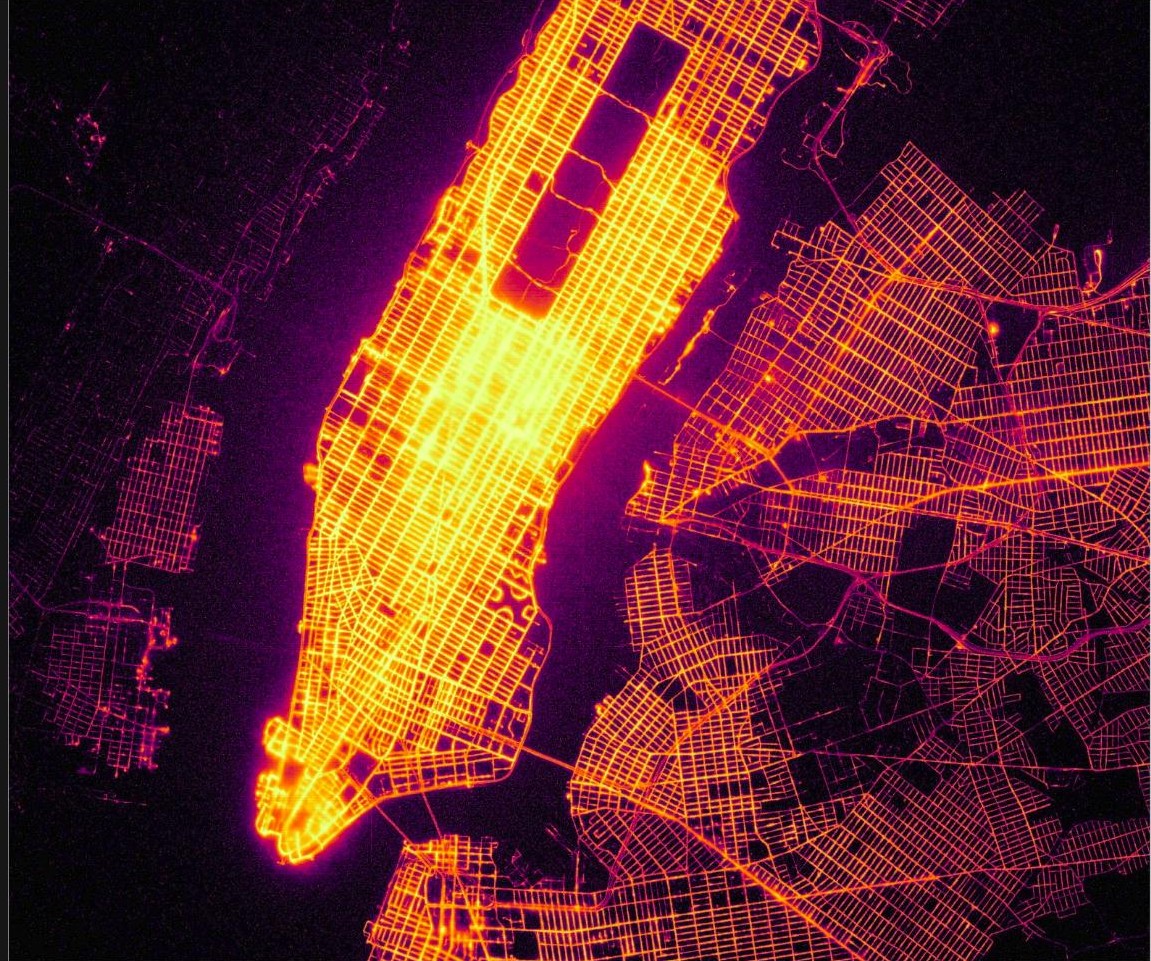
9. Global Internet Connectivity: The Digital Nervous System
Visualizations of internet infrastructure reveal the intricate web of global digital communication. Glowing network topologies show how information flows across continents, transforming abstract connectivity into visual poetry.
10. Climate Futures: Predictive Environmental Modeling
Advanced visualization techniques now allow us to see potential environmental scenarios. By mapping climate model predictions, researchers create visual narratives about potential planetary futures.
Conclusion: The Evolving Art of Visualization
Data visualization is more than a technical skill – it‘s a profound form of human communication. By bridging computational power, artistic design, and human perception, these visualizations tell stories that numbers alone cannot express.
As technologies continue evolving, we can expect even more profound and insightful visual narratives. The future of data visualization lies not just in technological advancement, but in our ability to translate complex information into human understanding.