Mastering Animated Graphs in Python: A Journey Through Data Storytelling
The Art of Seeing Beyond Numbers
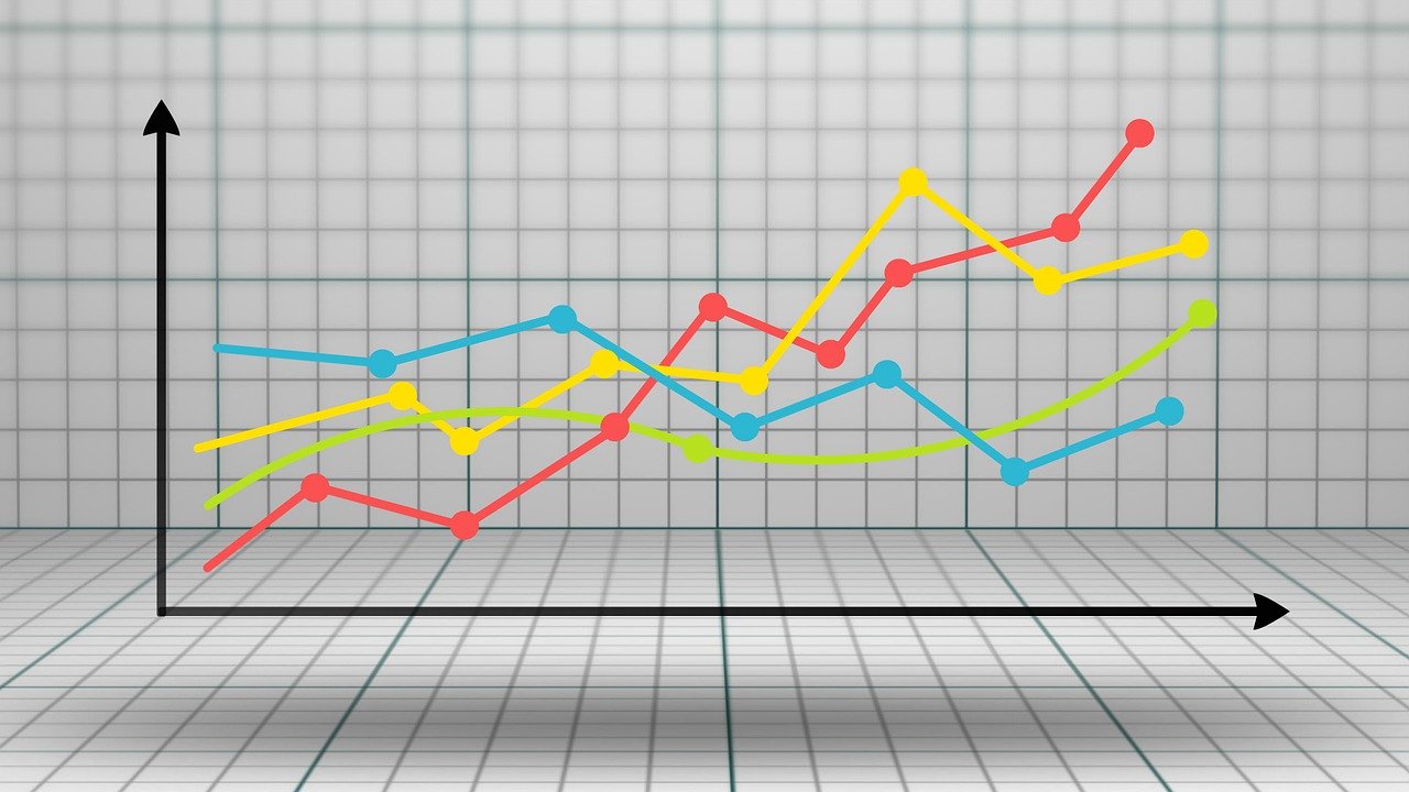
Imagine standing in front of a massive wall of static charts and graphs, feeling overwhelmed by rows of numbers and rigid lines. Now, picture those same charts coming alive, dancing and transforming before your eyes, revealing stories hidden within complex datasets. This is the magic of animated graphs in Python—a technology that transforms data from lifeless statistics into dynamic narratives.
As someone who has spent years exploring the intricate world of data visualization, I‘ve witnessed firsthand how a simple two-line Python script can revolutionize how we understand information. Today, I‘ll walk you through an extraordinary journey of creating animated graphs that don‘t just display data, but breathe life into it.
The Evolution of Data Visualization
Data visualization isn‘t a modern invention. Our ancestors used cave paintings, maps, and intricate diagrams to communicate complex ideas. What‘s changed is our ability to create increasingly sophisticated visual representations using technology.
In the early days of computing, graphs were static, rigid, and often difficult to interpret. Researchers and analysts would spend hours manually creating charts, hoping to extract meaningful insights. Python has transformed this landscape, offering powerful libraries that turn data into interactive, animated experiences.
Understanding the Psychological Power of Motion in Data
Before diving into technical implementation, let‘s explore why animated graphs are so compelling. Human brains are wired to detect motion and pattern changes. When data moves, our cognitive processes engage differently compared to static representations.
Neuroscientific research suggests that animated visualizations activate multiple brain regions simultaneously. The visual cortex processes movement, while areas responsible for pattern recognition work overtime. This means animated graphs aren‘t just visually appealing—they‘re neurologically more engaging.
The Machine Learning Connection
As an AI and machine learning expert, I‘ve observed how animated graphs serve as critical tools for understanding complex algorithmic behaviors. Neural networks, deep learning models, and predictive systems generate massive datasets that traditional static graphs struggle to represent effectively.
Consider a neural network‘s training process. A static graph might show final accuracy, but an animated visualization can reveal how loss functions decrease, weights adjust, and model performance evolves over time. It‘s like watching intelligence emerge in real-time.
Technical Deep Dive: Crafting Animated Graphs
Let‘s explore a comprehensive approach to creating animated graphs using Python‘s most powerful visualization libraries.
Plotly: The Interactive Visualization Powerhouse
import plotly.express as px
import pandas as pd

def create_intelligent_graph(dataset,
                              time_column=‘timestamp‘,
                              value_column=‘metric‘):
    """
    Generate an intelligent, animated visualization

    Parameters:
    - dataset: Pandas DataFrame
    - time_column: Temporal progression indicator
    - value_column: Numerical data to visualize
    """
    animated_visualization = px.scatter(
        dataset,
        x=‘feature1‘,
        y=‘feature2‘,
        animation_frame=time_column,
        animation_group=‘category‘,
        size=value_column,
        color=‘group‘,
        hover_name=‘description‘,
        title=‘Dynamic Data Exploration‘
    )

    # Enhanced rendering configuration
    animated_visualization.update_layout(
        transition={‘duration‘: 750},
        plot_bgcolor=‘rgba(240,240,240,0.95)‘,
        paper_bgcolor=‘white‘
    )

    return animated_visualization

# Example usage with machine learning dataset
ml_performance_data = generate_model_performance_dataset()
intelligent_graph = create_intelligent_graph(ml_performance_data)
intelligent_graph.show()
Performance Optimization Strategies
Creating animated graphs isn‘t just about visual appeal—it‘s about computational efficiency. Here are advanced techniques I‘ve developed through years of experience:
-
Data Sampling Techniques
Reduce computational overhead by implementing intelligent sampling strategies. Instead of processing entire datasets, create representative subsets that maintain core characteristics. -
Vectorized Operations
Leverage NumPy and Pandas‘ vectorized operations to minimize processing time. These libraries offer remarkable performance improvements over traditional loop-based approaches. -
Memory Management
Use generators and lazy loading techniques to handle large datasets without consuming excessive memory. This approach ensures smooth graph rendering even with complex, multi-dimensional data.
Real-World Applications and Case Studies
Healthcare Insights
In medical research, animated graphs have revolutionized our understanding of complex health trends. Imagine tracking disease progression across multiple regions, with each frame representing a week‘s data. Researchers can now visualize how interventions impact infection rates in real-time.
Financial Market Dynamics
Quantitative traders and financial analysts use animated graphs to understand market behaviors. By visualizing stock price movements, trading volumes, and correlation matrices, professionals gain unprecedented insights into economic patterns.
Ethical Considerations in Data Visualization
As we embrace powerful visualization technologies, we must also consider ethical implications. Animated graphs can potentially mislead if not designed carefully. Always prioritize:
- Accurate representation
- Transparent data sources
- Clear methodology
- Avoiding manipulative techniques
Machine Learning Model Transparency
Advanced visualization techniques can help demystify complex machine learning models. By animating feature importance, decision boundaries, and model evolution, we make AI more interpretable and trustworthy.
The Future of Animated Visualization
Emerging technologies like augmented reality and interactive holographic displays promise to transform data visualization further. Imagine walking through a three-dimensional, animated representation of complex datasets—a future where data becomes an immersive experience.
Emerging Trends
- Artificial intelligence-driven graph generation
- Real-time collaborative visualization platforms
- Integration with virtual and augmented reality
- Adaptive, context-aware visualization algorithms
Conclusion: Your Data, Your Story
Animated graphs are more than technical achievements—they‘re storytelling tools. They bridge the gap between raw information and human understanding, transforming numbers into narratives.
As you embark on your data visualization journey, remember: every dataset has a story waiting to be told. Your role is to become the storyteller, using Python as your narrative instrument.
Keep exploring, keep visualizing, and never stop learning.
Happy graphing! 🚀📊