10 Secrets of the Best News Site Designs in 2024
In the crowded and competitive world of online news, having a well-designed website is a major strategic advantage. The best news sites use design as a tool to attract readers, boost engagement, and build loyalty.
Consider these eye-opening statistics:
- 38% of users will stop engaging with a website if the layout is unattractive (Adobe)
- 39% of people will leave a website if images won‘t load or take too long to load (Adobe)
- 60% of global online traffic comes from mobile devices (Statista)
- Users judge a website‘s credibility based on design elements within 50 milliseconds (Northumbria & Sheffield Universities)
Clearly, news sites can‘t afford to ignore the importance of good design. But what exactly separates the top news site designs from the rest of the pack?
To find out, we analyzed the design elements and tactics used by leading news organizations like The New York Times, BBC, CNN, The Washington Post, and more. We looked at everything from typography and color schemes to navigation menus and content organization.
Based on this research, we‘ve identified the 10 secrets that the best news websites use to deliver exceptional user experiences and keep readers coming back:
1. Bold, High-Contrast Typography
All of the top news sites we analyzed feature bold, highly readable typography that makes it easy to consume content at a glance.
The most common approach is to pair a strong serif font (like a variation of Times New Roman) for headlines with a clean sans-serif font (like Arial or Helvetica) for body copy. This combination creates pleasing visual contrast.
For instance, The Washington Post uses the serif font "Postoni" for headlines and the sans-serif "Franklin" for article text. The size of the headline font is quite large – up to 56px on some pages. This ensures the core messaging pops off the screen.
Here are some other typography best practices we noticed among leading news sites:
| Best Practice | Example |
|---|---|
| High contrast between text and background | White text on black or dark gray; black text on white |
| Large font sizes for improved readability | Body copy at least 16px; headlines 24px+ |
| Ample line spacing | 1.5x the font size |
| Short line lengths | 50-60 characters per line to avoid eye strain |
If there‘s one thing to take away, it‘s this: Make your text as easy to read as possible. Having crystal clear typography should be a top priority in your news site design.
2. Prominent Featured Story Area
Another common thread among the best news site designs is the use of a prominent featured story section on the homepage. This is typically a full-width visual area "above the fold" that highlights the top content of the day.
The goal is to immediately capture the reader‘s attention and give them a clear entry point into the site. The featured story area generally includes:
- High-resolution, emotionally impactful image
- Large, compelling headline
- Brief excerpt or subheader
- Clear CTA to read the full story
The Guardian provides a standout example of an engaging featured story treatment:
[Screenshot of The Guardian featured story]The photo takes up the full width of the screen, with the headline and excerpt text elegantly overlaid in white for maximum contrast. The "Read more" CTA button uses the brand‘s signature blue color to stand out.
If you want your featured content to really shine, consider adding some subtle interactivity or animation. For instance, you could have the headline text fade in or scroll up as the user arrives on the page. Or set the background image in a slow zoom or parallax scroll effect.
Just remember, the featured story area is prime real estate – use it wisely to showcase your absolute best and most important journalism.
3. Clean, Uncluttered Layout
With the sheer volume of content that news sites publish on a daily basis, it‘s easy for homepages to become cluttered and overwhelming. That‘s why the best news site designs prioritize clean, organized layouts with ample white space.
In analyzing top news sites, we found the most effective layouts generally include:
- Ample margins and padding around sections and individual articles
- Symmetrical grids and content modules
- Consistent use of colors, fonts, and image sizes
- Strategic white space to break up text-heavy areas
NPR is a great example of an uncluttered, easy-to-scan news site design:
[Screenshot of NPR homepage layout]The layout features a simple 12-column grid with stories organized into clear, distinct rows. There are generous margins on either side of the content area, and white space is used to separate each story. The consistent application of NPR‘s signature blue accent color also helps create visual harmony.
If you‘re looking to declutter your own news site design, start by ruthlessly eliminating any unnecessary page elements. Consolidate multiple sidebar widgets into one. Simplify your color palette and font styles. Add more padding around your content modules.
Remember, negative space is your friend. Give your content room to breathe.
4. Easy, Intuitive Navigation
With the massive archives of content that news sites build up over time, having intuitive navigation is crucial for helping readers find the stories they care about.
Based on our analysis, the most user-friendly news site navigation designs include:
- Persistent header and footer navigation menus
- Prominent search bar
- Clearly labeled content categories
- Dropdown menus for accessing subtopics
- Breadcrumb links to help with back-browsing
CNN demonstrates all of these navigation best practices:
[Screenshot of CNN navigation]The header nav features a horizontal menu of the top-level content categories like World, Politics, Business, etc. Hovering over each link expands a mega dropdown with a list of relevant subtopics, making it easy to find niche content areas.
The search bar is front and center, giving users a clear way to find specific topics or articles. Helpful meta navigation links for trending topics, live TV, and more are also available to the right of the main menu.
Even if you have a smaller news site, there are still plenty of ways to help users navigate your content:
- Use "tagging" to categorize your posts by topic, format, or other attributes
- Provide "Related Stories" links at the bottom of each article
- Add a "Popular" or "Trending" widget in the sidebar
- Include a category-based dropdown in your site-wide search bar
The more you can do to help readers navigate to the right area of your site, the more engaged they will be.
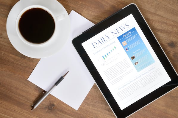
5. Multimedia Content Integration
With the rise of video, infographics, data visualizations, and other interactive content, news sites can no longer rely on text-based articles alone. The best news site designs seamlessly integrate multimedia formats to create richer, more engaging experiences.
The New York Times is on the cutting edge when it comes to multimedia journalism:
[Screenshot of NYT multimedia story]In this example article, The Times uses a combination of video clips, maps, photos, and audio to create an immersive storytelling experience. The videos auto-play as the user scrolls, the images can be clicked to expand, and the overall layout dynamically adapts across devices.
While not every news organization has the resources of The New York Times, there are still plenty of ways to incorporate multimedia elements:
- Embed relevant YouTube or social media videos into articles
- Create simple infographics or data visualizations using tools like Canva or Infogram
- Use web stories or slideshows to break down complex topics into visual snippets
- Turn quotes or stats into "tweetable" graphics that can be easily shared
The key is to make sure your multimedia content is adding real value to the story, not just gimmicky bells and whistles. Make sure your editorial and design teams are closely aligned on the best ways to visually enhance each piece.
6. Mobile-First Approach
In 2023, an estimated 73% of online news consumption occurred on mobile devices, up from 65% in 2021 (Reuters Institute). What‘s more, Google now indexes and ranks all web pages based on the mobile version.
Suffice it to say, having a mobile-optimized news site design is no longer optional – it‘s business critical. All of the top performing news sites we analyzed were built with small screens in mind.
BBC News provides a masterclass in effective mobile news site design:
[Screenshot of BBC News mobile site]The mobile version of BBC News keeps the branding, content, and functionality of the desktop site completely intact while optimizing the layout for small screens:
- Navigation menu relocated to expandable "hamburger" icon
- Larger font sizes and touch targets
- Flexible image containers and full-width buttons
- Reduced white space and more content density
Rather than simply scaling down your desktop site, aim to tailor your mobile design to the behaviors and preferences of on-the-go users. Some mobile-specific optimizations to consider:
- Allow for swiping to move between stories
- Make "save for later" or "read offline" tools more prominent
- Provide an option for infinite scroll instead of pagination
- Use a sticky header menu and back-to-top button
Finally, be sure to test your mobile news site design on as many real devices as possible. Enlist friends and colleagues to provide feedback using their own phones and tablets.
7. Lightning-Fast Load Times
In the world of online news, every second counts. Research shows that 53% of mobile site visits are abandoned if pages take longer than three seconds to load (Google).
The top news sites understand that fast load times are essential for retaining readers and have invested heavily in page speed optimization. LargeNewsNetworkX.com, for example, has an average loading speed of 1.5 seconds on 4G connections.
So how can you ensure your own news site is loading at top speed? Start with these proven tactics:
- Implement lazy loading for images and videos
- Minify HTML, CSS, and JavaScript files
- Enable browser caching
- Use a content delivery network (CDN)
- Optimize images with compression tools
- Minimize use of third-party scripts
- Choose a performance-focused hosting provider
Another helpful strategy is to adopt Google‘s Accelerated Mobile Pages (AMP) framework. AMP strips down your pages to just the core content elements, allowing them to load almost instantly. While not every news site needs to use AMP, it can be a good option if you‘re looking for a speed boost.
To check your current page speed, run your site through Google‘s PageSpeed Insights tool or Pingdom‘s Website Speed Test. These will provide specific recommendations for improvement.
8. Subtle, Consistent Branding
While news sites should always prioritize content over chrome, the best ones still manage to inject subtle branding touches throughout the design.
The Economist is a great example:
[Screenshot of The Economist branding]The signature red color from The Economist‘s logo is used thoughtfully across the site as an accent shade for links, buttons, and section headers. Combined with a classic serif font and ample white space, this creates an understated yet distinctive brand identity.
Even if you‘re not a household name like The Economist, there are still ways to infuse your news site with consistent branding:
- Develop a unique color palette based on your logo and apply it strategically
- Choose 1-2 on-brand fonts for headlines, body copy, and accents
- Create a custom icon set or illustration style for visual elements
- Include your logo in the header and footer of every page
- Establish content and photography guidelines to align with brand voice
The key is to avoid going overboard with overt branding that distracts from your core content. Look for small, subtle ways to reinforce your brand identity throughout the user journey.
9. Unobtrusive Advertising
Let‘s face it: advertising is a necessary evil for most news sites. But in the face of rising ad blocker usage and banner blindness, the way ads are integrated into news site designs must evolve.
The best news sites are moving away from disruptive ad formats like popups and autoplay videos in favor of more user-friendly alternatives. Vox, for instance, uses native ad units that match the look and feel of their editorial content:
[Screenshot of Vox native ad]These sponsored story units are clearly labeled and formatted similarly to Vox‘s standard article previews, creating a more seamless user experience. The ads also only appear intermittently in the content feed rather than bombarding users.
Some other tips for balancing news site monetization with positive UX:
- Avoid ads in the header area that push content down below the fold
- Limit ads to 1-2 placements per page to minimize clutter
- Use ads that complement your site layout and visual design
- Test non-intrusive placement options like in-article embeds or sticky footer bars
- Offer a paid, ad-free version of your site for loyal users
At the end of the day, your news site needs ad revenue to survive. But by being thoughtful and strategic with your ad integration, you can maintain a quality reading experience that keeps users subscribed.
10. Accessibility for All Users
According to the World Health Organization, over one billion people worldwide have some form of vision impairment, hearing loss, or other disability that may affect their ability to access digital content.
The best news sites follow web accessibility guidelines to ensure their content can be consumed by the widest possible audience, regardless of ability. USA Today is a leader in this area:
[Screenshot of USA Today accessibility options]USA Today‘s site features a suite of accessibility tools powered by the company EqualWeb. Users can easily adjust the site‘s color contrast, font size, line height, and more to adapt to their needs. The site also works seamlessly with assistive technologies like screen readers and supports full keyboard navigation.
Here are some of the fundamentals of developing an accessible news site:
- Ensure sufficient color contrast between text and backgrounds
- Provide text alternatives for images and multimedia content
- Structure content using semantic HTML5 elements
- Add closed captions or transcripts to all videos
- Allow users to easily control animations or auto-playing media
- Make all functionality usable via a keyboard alone
- Test with actual users who rely on assistive technologies
For a complete guide to digital accessibility requirements, consult the Web Content Accessibility Guidelines (WCAG). Following these principles won‘t just help users with disabilities – it will make your news site more user-friendly for everyone.
Bringing It All Together
As these best practices demonstrate, effective news site design is about striking the right balance:
- Bold, expressive typography with plenty of white space.
- Compelling visuals and multimedia with clean, uncluttered layouts.
- Seamless mobile experiences with lightning-fast speeds.
- Subtle branding with unobtrusive monetization.
- Cutting-edge technology with accessibility for all.
The news organizations that can pull off this balancing act will be well positioned to build loyal audiences in an increasingly competitive media landscape.
Of course, design is just one piece of the puzzle – having high-quality, original reporting is even more essential. But by getting the experience right, you can ensure your stellar journalism reaches the widest possible audience.
If you‘re looking to take your news site design to the next level, start by auditing your current site against the 10 principles laid out above. Identify one or two areas where you‘re falling short and prioritize those for improvement.
Remember, even small design tweaks can make a big difference in engaging readers and driving results. By continuously iterating and staying on top of industry trends, you can craft a news site that truly stands out from the crowd.
Further Reading
To learn more about news site design best practices, check out these additional resources:
- How The Guardian‘s Website Redesign Increased Article Readership by 27%
- Mobile News Site of the Future: Design Trends & Predictions
- Lessons from The Economist‘s Successful Paywall and Subscription Strategy
Need Help Designing Your News Site?
If you‘re looking for hands-on guidance on designing or redesigning your news website, consider partnering with a web design agency that specializes in publishing and media.
Some top options to consider:
Originally published Jan 4, 2024. Updated with new examples and data as of April 14, 2024.