CSS Showdown: The Ultimate Battle Between Transitions and Animations
Picture this: you‘re browsing a website when a button catches your eye. As you hover over it, the button expands and changes color smoothly. Click it and a modal window fades in, containing an animated infographic. All these dynamic effects were likely created with either CSS transitions or animations. But what‘s the difference, and when should you use one over the other?
According to a study by W3Techs, over 80% of websites now use CSS transitions and/or animations to engage users and enhance the interactive experience. As these technologies have matured, the line between them has blurred. However, while they share some similarities, transitions and animations have key differences that impact how they perform and what they can accomplish.
A Brief History of CSS Transitions & Animations
CSS Transitions were first introduced in 2006 by the WebKit team, initially only in Safari. The feature proved so popular that it was quickly adopted by other browsers. The CSS Transitions Module reached W3C Candidate Recommendation status in 2013, making it an official web standard.
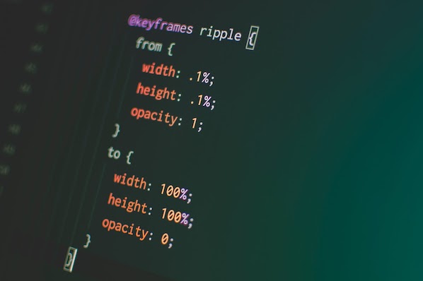
CSS Animations evolved out of transitions, initially appearing in 2007 in WebKit as CSS @keyframes rules. Allowing for more complex, multi-step animations, @keyframes were a game-changer. After several years of development and iteration, the CSS Animations Module became a W3C Recommendation in 2018.
So how exactly do transitions and animations compare? Let‘s break it down:
| Feature | CSS Transitions | CSS Animations |
|---|---|---|
| Triggering | Triggered by user interaction (e.g. :hover) | Can be triggered on load or by adding a class |
| Keyframes | Only initial and final states | Multiple keyframes to define intermediate states |
| Looping | Cannot loop, reverse when trigger removed | Can loop infinitely using animation-iteration-count |
| Timing Functions | Single timing function applied to entire transition | Different timing functions can be set between keyframes |
| Performance | Faster for simple effects due to browser optimizations | More powerful but can be less performant if overused |
In essence, CSS transitions are best for simple interface effects like button hovers or showing/hiding menus, while animations shine for more complex, multi-stage sequences or infinitely looping background visuals. As web animation expert Sarah Drasner puts it:
"Transitions are like riding a bicycle: you start at one point, end at another, and there‘s only really one route between the two. Animations are more like driving a car: you can go forwards, backwards, take multiple turns, and end up right back where you started if you want."
Mastering CSS Transition Effects
The beauty of CSS transitions lies in their simplicity. With just a few lines of code, you can create a buttery smooth transition between two element states. For example, this code will animate a button‘s background color and size on hover:
.button {
  background-color: #4285F4;
  transition: background-color 0.3s ease,
              transform 0.3s ease;
}

.button:hover {
  background-color: #0F9D58;
  transform: scale(1.1);
}
In this case, when a user hovers over a button, it will animate from blue to green while scaling up slightly over the course of 0.3 seconds. The browser takes care of rendering all the intermediate frames based on the start/end values and timing function.
CSS transitions are highly performant because browsers can optimize them and use GPU acceleration. According to Google, "transitioning transforms and opacity can often be handled by the compositor thread, meaning that the browser doesn‘t have to repaint the page for every frame of the animation."
However, transitions do have limitations. Because they rely on the cascade and inheritance, it‘s difficult to coordinate multiple transitions in a sequence. There‘s also no built-in way to loop a transition – it plays forward when triggered, reverses when the trigger is removed.
Pushing the Limits with CSS Animations
For more ambitious effects, CSS animations provide a robust toolset. Freed from transitions‘ start-end model, animations use @keyframes to define the styles of an element at various points in the animation sequence:
@keyframes bounce {
  0% {
    transform: scale(1);
  }
  50% {
     transform: scale(1.5);
  }
  100% {
     transform: scale(1);
  }
}

.ball {
  animation: bounce 2s cubic-bezier(.79,-0.3,.34,1.38) infinite;
}
This code defines a "bounce" animation that scales an element up and down using a custom cubic-bezier timing function. The infinite keyword tells it to loop continuously. Apply this animation to an element and it will appear to bounce playfully.
Animations can accomplish effects that simply aren‘t possible with transitions due to their support for:
- Multiple keyframes to define intermediate animation states
- Infinite looping with animation-iteration-count
- Playback controls like animation-direction and animation-play-state
- Motion paths using the new offset-path property
However, animations aren‘t without downsides. Because they aren‘t tied to a triggering event like transitions are, it can be trickier to coordinate animations with user interactions using JavaScript. Overusing animations can also negatively impact performance since they can‘t always be optimized by the browser in the same way transitions can.
Choosing the Right Tool for the Job
So when should you use CSS transitions vs. animations? It ultimately depends on the complexity of the effect you‘re trying to achieve and its role in the user experience.
Transitions are your go-to for:
- Simple UI interactions like button hovers
- Smoothly showing/hiding menus, tooltips, etc.
- Subtle text or color changes on focus/active states
- Animating state changes triggered by user input
Animations are better suited for:
- Complex, multi-stage effects
- Looping background animations
- Sequenced intro/outro effects
- Illustrative animations synced with scrolling
- Animating elements along a curved path
Let‘s look at two real-world examples to see this in action:
Example 1: Button Hover Effect
Imagine a "Download" button that should subtly pulse and change color when a user hovers over it. This is a perfect use case for a CSS transition:
.download-btn {
  background-color: #4285F4;
  transition: all 0.3s ease-out;
}

.download-btn:hover {
   background-color: #0F9D58;
   box-shadow: 0 0 10px rgba(0,0,0,0.5);
   transform: scale(1.05);
}
Example 2: Animated Onboarding Flow
Now picture an app onboarding flow where illustrations animate in, step-by-step, as the user scrolls. This calls for CSS animations choreographed with JavaScript:
@keyframes fadeInUp {
  0% {
     opacity: 0;
     transform: translateY(20px);
  }
  100% {
    opacity: 1;
    transform: translateY(0);
  }
}

.onboarding-step {
  opacity: 0;
  animation: fadeInUp 0.5s ease-out forwards;
}
const steps = document.querySelectorAll(‘.onboarding-step‘);
function playAnimations() {
steps.forEach((step, i) => {
if (step.getBoundingClientRect().top < window.innerHeight * 0.8) {
step.style.animationDelay = `${i * 0.2}s`;
step.classList.add(‘animate‘);
}
});
}
window.addEventListener(‘scroll‘, playAnimations);In this example, JavaScript code checks the scroll position and applies an .animate class to trigger each onboarding step animation in sequence. The animationDelay is set dynamically to stagger the start times.
According to a study by the Nielsen Norman Group, using animation in onboarding can increase user engagement by up to 80%. However, it‘s important not to go overboard – too many animations can be distracting and negatively impact performance.
Putting it all Together
When used strategically, CSS transitions and animations are powerful tools for enhancing user experience and evoking emotion. Transitions excel at simple UI interactions, while animations enable richer storytelling and choreography. By understanding their strengths and limitations, you can choose the right approach for bringing your interface to life.
Some key principles to keep in mind:
- Use transitions and animations to provide meaningful feedback and guide users‘ focus, not just for decoration.
- Prefer transitions for simple interactions, animations for complex sequences.
- Ensure animations perform well – aim for a steady 60fps, and use the Chrome DevTools Timeline to profile animation performance.
- Provide reduced motion options for accessibility. Respect the
prefers-reduced-motionmedia query and offer UI to turn off non-essential animations. - Have fun and experiment! CSS animations are a playground for creative expression on the web.
By mastering the art of animating user interfaces, you can create web experiences that not only function well, but spark joy and delight. Go forth and make the web come alive!


![10 Best Tools to Check Website Traffic [+ What They’re Best For]](https://greenlitcontent.com/wp-content/uploads/2026/04/20260423202841-69ea80f98bc02.jpg)
![25 Actor Website Design Examples We Love [+ How To Make Your Own]](https://greenlitcontent.com/wp-content/uploads/2026/04/20260423190926-69ea6e6618675.png)