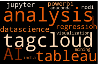
Tableau for Beginners: A Masterclass in Data Visualization Storytelling
The Art and Science of Seeing Data Differently
Imagine standing in front of a massive wall of incomprehensible numbers, charts, and spreadsheets. Overwhelming, right? Now picture transforming that complex maze into a crystal-clear story that speaks directly to your audience‘s understanding. This is the magic of data visualization, and Tableau is your wand.
As someone who has spent decades navigating the intricate landscapes of data analysis, I‘ve witnessed firsthand how visualization can transform raw information into powerful narratives. Tableau isn‘t just a tool; it‘s a bridge between complexity and clarity.
The Human Connection in Data
Before diving into technical details, let‘s understand why visualization matters. Our brains are wired to process visual information exponentially faster than text. A well-crafted visualization can communicate complex ideas in seconds, what might take paragraphs to explain.
Tableau: More Than Just a Software
Tableau represents a paradigm shift in how we interact with data. It‘s not merely a software product but a philosophy of understanding information. Born from academic research at Stanford University, Tableau emerged from a fundamental question: How can we make data more accessible and understandable?
The Evolution of Visual Analytics
The journey of data visualization is fascinating. From hand-drawn maps in ancient civilizations to complex digital dashboards, humans have always sought ways to represent information visually. Tableau continues this rich tradition, leveraging cutting-edge technology to democratize data understanding.
Understanding Tableau‘s Ecosystem
Tableau isn‘t a monolithic product but a sophisticated ecosystem designed to cater to diverse user needs. Each product serves a unique purpose, much like instruments in an orchestra, creating a harmonious data symphony.
Tableau Desktop: Your Creative Canvas
Think of Tableau Desktop as an artist‘s studio. Here, data transforms from raw numbers into compelling visual stories. It‘s where creativity meets analytical rigor. Professionals can drag, drop, and manipulate data with intuitive controls, making complex analysis feel like play.
Tableau Server: The Collaborative Hub
Imagine a digital conference room where data insights are shared seamlessly. Tableau Server enables organizations to publish, share, and collaborate on dashboards securely. It breaks down communication barriers, allowing insights to flow freely across departments.
Tableau Online: Data Without Boundaries
Cloud technology has revolutionized how we work, and Tableau Online embodies this transformation. Access your data visualizations from anywhere, collaborate in real-time, and break free from traditional software limitations.
The Psychology of Visual Data
Understanding data visualization goes beyond technical skills. It‘s about comprehending how humans perceive and process information. Our brains are pattern-recognition machines, constantly seeking meaning in visual representations.
Cognitive Load and Information Design
When designing visualizations, consider cognitive load—the mental effort required to process information. A well-designed dashboard reduces cognitive strain, allowing faster, more intuitive understanding.
Practical Visualization Strategies
Creating impactful visualizations isn‘t about complexity; it‘s about clarity. Here are nuanced strategies I‘ve developed through years of experience:
Color Psychology in Data
Colors aren‘t just aesthetic choices—they‘re communication tools. Blue might represent trust and stability, while red could signify urgency or importance. Understanding color psychology can dramatically enhance your visualization‘s impact.
Storytelling Through Data
Every dataset tells a story. Your job as a visualization expert is to uncover and communicate that narrative. Consider the emotional journey you want your audience to experience.
Technical Deep Dive: Tableau Mechanics
While Tableau appears user-friendly, underneath lies sophisticated technology. Understanding its mechanics helps you leverage its full potential.
Data Connection Strategies
Tableau supports numerous data sources, from traditional databases to real-time streaming platforms. The key is choosing the right connection method that maintains data integrity and performance.
Future of Data Visualization
As artificial intelligence and machine learning advance, data visualization will become increasingly sophisticated. Predictive analytics, automated insights, and interactive experiences are just the beginning.
AI-Powered Visualization
Imagine dashboards that not only display data but also provide intelligent recommendations. Machine learning algorithms could soon suggest the most effective visualization techniques based on your dataset.
Learning and Growing
Mastering Tableau is a journey, not a destination. Continuous learning, experimentation, and curiosity are your greatest assets.
Recommended Learning Path
- Start with fundamental courses
- Practice with diverse datasets
- Join community forums
- Attend visualization conferences
- Never stop exploring
Ethical Considerations in Data Visualization
As data visualization experts, we bear significant responsibility. Our visualizations can influence decisions, shape perceptions, and impact lives. Always prioritize transparency, accuracy, and ethical representation.
Conclusion: Your Data, Your Story
Tableau is more than a tool—it‘s a language for understanding our complex world. Whether you‘re a business professional, researcher, or curious learner, you have the power to transform data into meaningful insights.
Remember, behind every chart, graph, and dashboard is a human story waiting to be told. Your role is to be the storyteller, the translator of numbers into narratives.
Are you ready to begin your data visualization journey?