Color Psychology: How to Harness the Power of Color in Marketing and Branding
As humans, we‘re highly visual creatures—in fact, 90% of the information transmitted to our brains is visual. And out of all the visual cues we take in, color is one of the most powerful influencers of our behavior and decision-making.
This is especially true when it comes to marketing and branding. Research has shown that up to 85% of consumers cite color as the primary reason they choose a particular product. The right colors can increase brand recognition by up to 80%, directly impacting consumer confidence and sales.
Simply put, color psychology is a must-know for any marketer or entrepreneur. By understanding the meanings and emotional impacts of different colors, you can strategically use color to attract your ideal customers, communicate your brand personality, and motivate purchasing behavior.
In this in-depth guide, we‘ll dive into the fascinating science of color psychology and how you can apply it to build a memorable, impactful brand identity. Backed by research and expert insights, you‘ll learn:
- The universal psychological meanings of colors
- Real-world examples of color psychology in iconic brands
- How to choose the perfect color palette for your brand
- The measurable business impact of color
- Color theory basics and tools
- Best practices for using color in marketing and branding
Whether you‘re developing a new brand identity or want to refine your existing one, understanding color psychology will give you a powerful edge. Let‘s get started.
The Science of Color Psychology
The study of color psychology dates back to the late 1800s, when German psychiatrist Emil Kraepelin first documented the emotional effects of color on the psyche. In the decades since, a wealth of research has confirmed the powerful role color plays in human behavior.
One landmark study published in the Journal of the Academy of Marketing Science found that up to 90% of snap judgments made about products can be based on color alone. According to Dr. Satyendra Singh, who conducted the study, "People make up their minds within 90 seconds of their initial interactions with either people or products. About 62‐90 percent of the assessment is based on colors alone."
But color doesn‘t just influence whether we like a product—it can also impact our emotional state and physiological reactions. A report titled "The Impact of Color on Marketing" found that colors can increase brand recognition by up to 80%, learning and comprehension by 73%, and reading by 40%.
Certain colors have even been shown to have direct effects on the body:
- Red increases heart rate and stimulates appetite
- Blue lowers blood pressure and aids in concentration
- Green relaxes muscles and promotes healing
At the neurological level, color perception occurs in an area of the brain called the hypothalamus, which controls hormones and much of our behavior. When we see a certain color, it triggers the hypothalamus to send cascades of signals that impact our thoughts, emotions, and actions.
So what exactly are the meanings and psychological effects of each color? While individual experiences can vary, studies have found some nearly universal associations.
The Meanings and Emotions of Colors
Red: Passion, excitement, energy, action. Associated with movement, stimulation, and appetite. Can also signal danger or warning.
Orange: Friendliness, enthusiasm, affordability. Blends the power of red with the happiness of yellow. Encourages impulse purchases.
Yellow: Optimism, clarity, warmth. The most visible color, associated with the sun. Stimulates mental activity and grabs attention. Also used as a cautionary cue.
Green: Nature, harmony, growth, health. Easiest on the eyes and promotes balance. Can represent wealth, fertility, or eco-friendliness.
Blue: Trust, dependability, serenity, logic. Curbs appetite and is favored by men. Often used for conservative, traditional, or tranquil brands.
Purple: Creativity, imagination, luxury, spirituality. Combines the stability of blue with the energy of red. Frequently used for beauty and anti-aging products.
Pink: Femininity, romance, caring, tenderness. A toned-down red that makes consumers feel appreciated. Popular for targeting female audiences.
White: Purity, innocence, cleanliness, simplicity. Makes surrounding colors appear brighter. Can also be seen as cold, unfriendly, or empty.
Black: Power, elegance, sophistication, mystery. Conveys luxury and exclusivity. Also linked to grief, fear, or the unknown.
Brown: Ruggedness, earthiness, reliability, warmth. Associated with nature and the outdoors. Frequently used for food and beverage brands.
Of course, cultural context is key. In Western cultures, white symbolizes purity and innocence, while in parts of Asia it‘s associated with death and mourning. Green represents luck and wealth in the Middle East, but signifies disease in Malaysia.
As a general rule, warm colors (red, orange, yellow) tend to stimulate and energize, while cool colors (blue, green, purple) are more calming and subdued. Neutral colors like white, black, brown, and gray are more dependent on their shading and context to evoke emotions.
Color Psychology in Iconic Brands
Some of the most recognizable brands in the world are known for their signature color schemes as much as their products or logos. Here‘s how a few iconic brands expertly use color psychology in their identities:
Coca-Cola: The bold, energetic red conveys excitement, confidence, and youth—perfect for the world‘s leading soft drink.
Starbucks: The deep green represents growth, freshness, and earthiness, evoking the natural, inviting vibe of the coffee shop experience.
Cadbury: The distinctive purple has long been associated with royalty and wealth, positioning the brand as a premium, indulgent treat.
IKEA: The Swedish retailer‘s blue and yellow color scheme draws from the colors of the Swedish flag, reinforcing their national identity in a friendly, accessible way.
UPS: The brown color of UPS‘s delivery trucks and uniforms represents reliability, trust, and quality—key traits for a global shipping provider.
In each case, the colors aren‘t just aesthetically pleasing—they strategically align with the brand‘s personality, values, and target audience to create a cohesive identity.
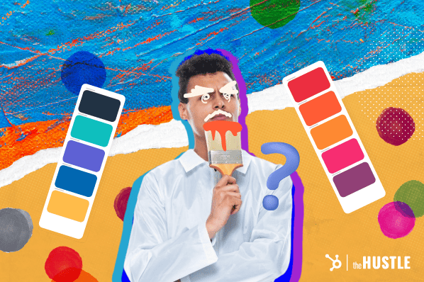
Choosing Your Brand‘s Perfect Color Palette
So how can you go about choosing the ideal color scheme for your own brand? Follow these steps to harness the power of color psychology in your brand identity.
-
Define your brand personality. What traits and emotions do you want people to associate with your brand? Are you playful or serious, luxurious or affordable, modern or traditional? Create a list of 3-5 key characteristics.
-
Consider your target audience. What are the demographics and psychographics of your ideal customer? What colors might appeal to them based on their age, gender, income level, personality, and values?
-
Research your industry. What colors are commonly used by other brands in your market? Do you want to conform to those norms or stand out from the crowd? Certain colors are strongly associated with particular industries (e.g. blue for healthcare, green for sustainability).
-
Choose colors that align with your brand traits. Refer to the color meanings and emotional impacts discussed above. Select 1-3 primary brand colors that match the characteristics you want to portray. Limit your palette to avoid looking cluttered or confusing.
-
Consider color theory. Colors don‘t exist in isolation but interact with each other. Using complementary colors (opposites on the color wheel like blue and orange) creates an energizing contrast. Analogous colors (adjacent on the color wheel like blue and green) are more harmonious.
-
Test for accessibility. Ensure your color palette is easy to read for people with visual impairments by checking the contrast ratio between text and background colors. Tools like WebAIM‘s Color Contrast Checker are helpful for this.
-
Create a brand style guide. Document your chosen color palette with specific hex codes, Pantone numbers, or RGB values. Specify how and where each color should be used across your website, logo, marketing materials, and products. Consistency is key to building brand recognition.
The Business Impact of Color
The colors you choose for your brand aren‘t just an artistic decision—they have a direct impact on your bottom line. One study found that 85% of consumers cite color as the primary reason they purchased a particular product, and 80% believe color increases brand recognition.
Color can also influence how much consumers are willing to pay:
- One experiment showed that a yellow background on a sales page increased conversion rates by 14.7% compared to a white background.
- Ads in color are read up to 42% more often than the same ads in black and white.
- Color can improve readership of direct mail pieces by 55%, learning from ads by 78%, and comprehension by 73%.
Simply put, the strategic use of color gives you a significant competitive advantage. People decide whether or not they like a product in 90 seconds or less—and 90% of that decision is based solely on color.
Color Theory 101
To wield color psychology effectively, it‘s helpful to understand some fundamental principles of color theory, the science of how colors interact with each other.
The color wheel, invented by Sir Isaac Newton in 1666, is the foundation of color theory. It arranges colors in a circular spectrum, demonstrating the relationships between primary, secondary, and tertiary colors.
- Primary colors are red, yellow, and blue—they can‘t be created by mixing other colors.
- Secondary colors (green, orange, purple) are created by mixing two primary colors.
- Tertiary colors (yellow-orange, red-orange, red-purple, blue-purple, blue-green, and yellow-green) are created by mixing a primary and secondary color.
Colors also have three key properties:
- Hue is what we usually mean when we say "color"—the dominant wavelength of light
- Saturation refers to the intensity or purity of the hue (a red apple is highly saturated, while a washed-out red is desaturated)
- Value measures a color‘s lightness or darkness (pink is a light value of red, while maroon is a dark value)
When choosing colors for your brand or marketing materials, consider how they will interact based on color harmonies:
- Complementary colors are opposites on the color wheel, like red and green. They create high contrast and visual interest.
- Analogous colors are side by side on the color wheel, like blue and green. They create a smooth, harmonious look.
- Triadic colors are evenly spaced on the color wheel, like red, yellow, and blue. They offer a vibrant, balanced effect.
There are also cultural and psychological factors to consider. In a survey, 26% of participants said green was the easiest color on their eyes, followed by purple (17%) and blue and orange (tied at 13%).
Certain color combinations can be challenging for people with color blindness—approximately 8% of men and 0.5% of women have the common form of red-green color blindness. Always consider accessibility when designing color palettes.
Putting Color Psychology into Practice
Now that you understand the science and theory behind color psychology, how can you apply it to your own marketing and branding efforts? Here are some best practices.
Use colors consistently.
Develop a cohesive color palette and use it consistently across all touchpoints—logo, website, packaging, ads, social media, etc. Color increases brand recognition by up to 80%, so leveraging the same colors repeatedly will help ingrain your brand identity in consumers‘ minds.
Consider context and audience.
Colors can mean different things in different situations and to different people. Red might represent passion and energy in one context, but danger or defiance in another. Always consider how your target audience will perceive a color based on their unique demographics, culture, and your specific industry.
Don‘t neglect other design elements.
Color should be one component of your overall brand identity, not the only factor. Typography, imagery, and messaging also play a vital role. Colors impact us most when they‘re repeated, so make sure to reinforce your brand colors in photos, illustrations, and other visual elements.
Test and iterate.
Don‘t be afraid to A/B test different color variations to see what resonates most with your audience. Tools like Google Optimize make it easy to experiment with color on your website and landing pages and track the results. You can also survey your customers to get direct feedback on color preferences.
The Future of Color Psychology
As our world becomes increasingly digitized, color psychology is evolving in fascinating ways. With the rise of immersive technologies like virtual and augmented reality, marketers have new opportunities to leverage color in impactful, exciting ways.
For example, studies have shown that in VR environments, blue hues increase feelings of relaxation while red hues increase excitement and arousal. Warm-tinted lighting has also been shown to enhance the emotional impact of VR experiences compared to cool-tinted lighting.
As more brands venture into the metaverse and AR, strategic color choices can help create more engaging, emotionally resonant experiences. We may see colors taking on new cultural meanings as these technologies reshape the way we interact.
Accessibility will also be a key consideration in the future of color use in digital media. Tools like ChromeLens and Color Oracle simulate different types of color vision deficiency, helping designers create palettes that are perceivable by all users.
Harnessing the Power of Color
Color is a powerful psychological tool that every marketer and entrepreneur should understand how to wield. By tapping into the unique emotional and cognitive effects of different hues, you can strategically use color to shape your brand identity, attract your target audience, and boost your bottom line.
From conducting competitor research to building a cohesive color palette to A/B testing different combinations, taking a data-driven approach to color psychology is essential. With the wealth of research and tools available today, there‘s no excuse not to make informed, impactful color choices.
Of course, color is just one piece of the branding puzzle. To create a truly memorable brand, you‘ll also need to develop a strong brand voice, visual identity, and messaging. But used strategically, color can be the secret weapon that makes your brand unforgettable.
Key Takeaways:
- Colors evoke near-universal psychological and emotional responses
- Color can increase brand recognition by up to 80% and influence purchasing decisions
- Different colors are associated with different traits, e.g. blue with trust, green with health
- Cultural context, audience demographics, and color theory all impact color perception
- Test color combinations and use them consistently across touchpoints for maximum impact
- VR/AR and accessibility are key considerations for the future of color in digital media
So what are you waiting for? Start exploring the fascinating world of color psychology and discover the perfect palette to take your brand to new heights. Your future customers will thank you.