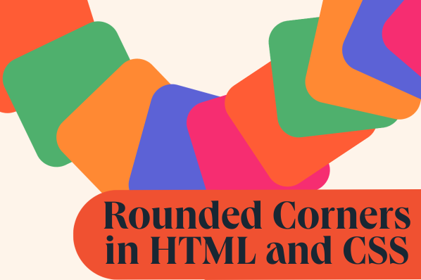
The Ultimate Guide to CSS Rounded Corners: Boost Engagement With border-radius
As a web designer, it‘s the little details that can take your designs from good to great. Rounded corners are one of those subtle but powerful techniques that can instantly make your pages look more polished and professional while enhancing the user experience. In this in-depth guide, we‘ll explore everything you need to know about creating beautifully rounded corners with CSS.

Why Rounded Corners Matter
Before we dive into the code, let‘s consider why rounded corners are so important in modern web design:
- Visual Appeal: Rounded corners give elements a softer, friendlier appearance compared to sharp edges. They can make your designs feel more inviting and less intimidating to users.
- Improved Usability: Studies have shown that rounded corners draw the eye and make clickable elements like buttons more noticeable and easier to identify. This can lead to higher engagement and conversion rates.
- Branding & Style: Rounded corners have become a defining characteristic of many brands‘ design languages. Using them consistently can help create a cohesive look and feel across your website or app.
Now that we understand the "why," let‘s get into the "how" of creating rounded corners with CSS.
Introducing border-radius
The border-radius property is the key to unlocking the power of rounded corners in your designs. It allows you to define the radius of an element‘s corners using a variety of units, most commonly pixels (px) or percentages.
Here‘s the basic syntax:
.rounded {
  border-radius: 20px;
}
In this example, all four corners of the element with class "rounded" will have a radius of 20 pixels, resulting in a gentle rounding effect.
Shorthand vs. Longhand
border-radius is a shorthand property that lets you set the radius for all four corners at once. But you can also target each corner individually using these longhand properties:
border-top-left-radiusborder-top-right-radiusborder-bottom-right-radiusborder-bottom-left-radius
This gives you more fine-grained control over the appearance of each corner. For example:
.custom-rounded {
  border-top-left-radius: 50px;
  border-top-right-radius: 10px;
  border-bottom-right-radius: 0;
  border-bottom-left-radius: 50px;
}
This would create an element with a large rounded corner on the top left, a small rounding on the top right, no rounding on the bottom right, and a large rounded corner on the bottom left.
Using Different Units
Along with pixels, you can use other units like ems, rems, or percentages to define your border radius. Percentages in particular can be useful for creating fully circular elements.
.circle {
  width: 200px;
  height: 200px;
  border-radius: 50%;
}
With a border radius of 50% applied to a square element, you get a perfect circle. This technique is commonly used for profile avatars and other circular UI elements.
Creating Elliptical Corners
By default, border-radius creates circular rounded corners. But you can also make elliptical corners by using two values separated by a slash:
.elliptical {
  border-radius: 50px/25px;
}
The first value defines the horizontal radius, while the second value after the slash sets the vertical radius. This lets you create corners that are more elongated in one direction than the other.
Real-World Examples
Rounded corners can be found all over the web, enhancing the look and feel of countless sites and apps. Here are just a few examples:

Airbnb uses rounded corners extensively in their card-based layouts for rental listings. The rounded images and containers create an inviting, friendly aesthetic.

Stripe‘s homepage makes great use of rounded buttons to draw attention to key calls-to-action. The generous border radius makes the buttons pop and encourages visitors to click.
Medium has made circular avatars a defining part of their brand identity. The fully rounded profile pictures appear throughout the site, adding visual interest and a sense of community.
UX Considerations
When implementing rounded corners, it‘s important to consider the impact on user experience. Some key factors to keep in mind:
- Consistency: Use rounded corners consistently across your site or app for a cohesive look. Avoid mixing squared and rounded elements haphazardly.
- Radius Size: Be judicious with the size of your border radius. Very large rounded corners can look cartoonish and undermine credibility. Aim for subtle rounding that feels natural.
- Accessibility: Ensure that rounded corners don‘t compromise the usability of interactive elements like buttons and form fields. Make sure the click/tap area is large enough and that rounding doesn‘t cut off any important content.
- Performance: While border-radius is quite efficient, be mindful of how many rounded elements are on the page. Excessive use of rounding, especially on complex elements, could impact rendering speed on older devices.
Advanced Tips
To take your rounded corner skills to the next level, try out some of these advanced tips:
- Pill Shapes: Combine generous
border-radiusvalues with a fixed height to create fully rounded, pill-shaped elements. Great for tags and filters.
.pill {
  height: 40px;
  border-radius: 20px;
}
.leaf {
  border-top-left-radius: 100px 50px;
}
.asymmetric {
  border-top-left-radius: 50px 100px;
  border-bottom-right-radius: 10px 30px;
}
Rounded Corners for the Win
Rounded corners may seem like a small detail, but they can have an outsized impact on the overall look and feel of your web designs. By using the border-radius property strategically, you can create interfaces that are more engaging, user-friendly, and memorable.
So don‘t cut corners when it comes to your designs – round them out with border-radius and watch your users‘ delight soar. Happy rounding!